Apollo.io UX Work
As the only UX person at the company, I ran think-aloud interviews and card sorted the 100+ search filters. I proposed five design changes, presented an onboarding overhaul to the VP of Growth, and started the first accessibility audit.

UX Intern | June - August 2021
Tools: Optimal Workshop, Figma, Miro, Fullstory, Amplitude Platform: Web
Role
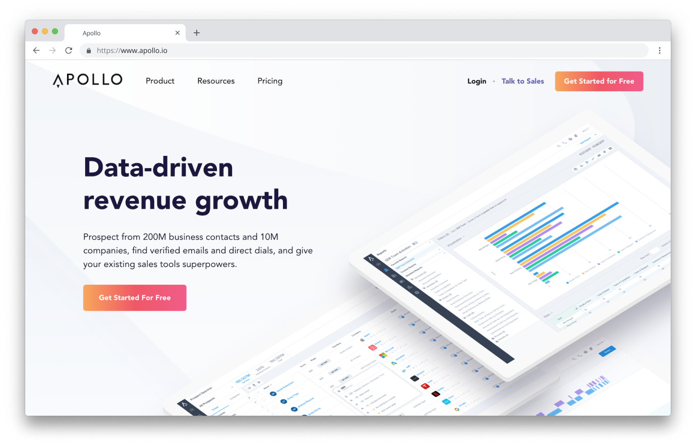
As the sole UX person at Apollo.io — a 150-person Series B startup with over $40M in funding — I was tasked with reducing mental strain of the product for new users, with a focus on the prospecting/search functionality.
Overview
Conducted 10 user interviews, analyzed 60 hours of session recordings, proposed 35 onboarding changes to the VP of Growth, and launched the company's first accessibility initiative.
Three out of five proposed design changes were accepted and implemented. The accessibility work started a color palette revamp and design system audit that continued after my internship.
The Task at Hand
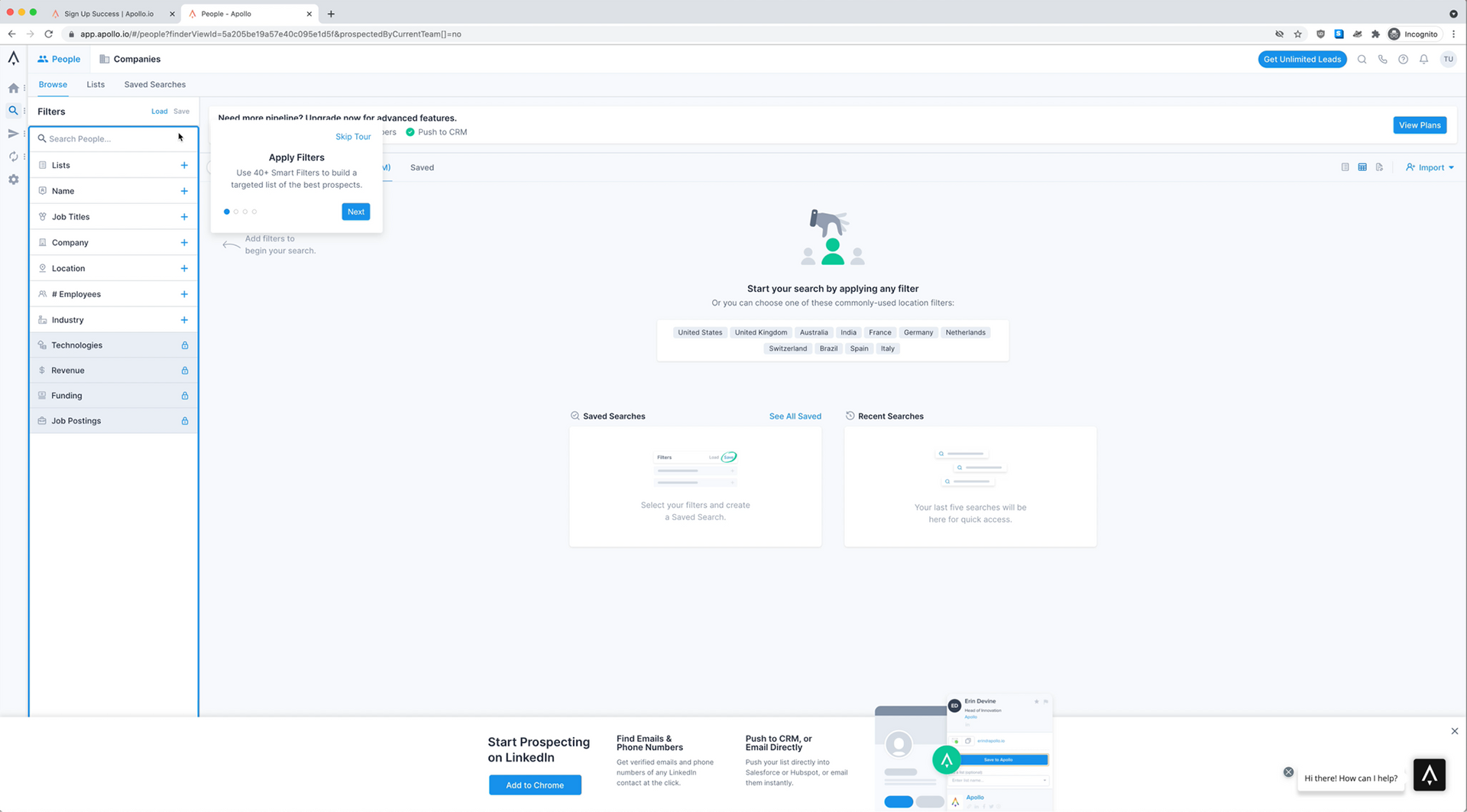
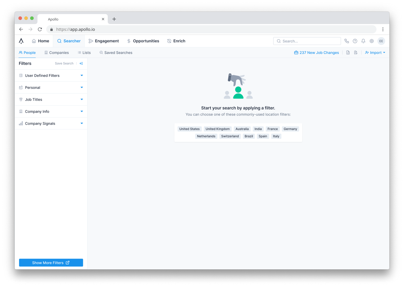
The immediate problem: how might we decrease the mental strain of the user interface on a new user? At first glance, there's a lot going on — 11 filters, pop-ups, and calls-to-action that can be distracting or disorienting.
The growth team was already focused on making people filtering more intuitive. With filters as my first area of focus, I set out to:
- Interview users to learn about their current workflow
- Interview new users to learn their first impressions
- Conduct a survey to find the most important categories to help condense filters
User Research
I used Apollo's own prospecting tool to recruit 10 SDRs who used modern sales software but had never used Apollo. Each interview had three parts:
- Contextual inquiry — walked through their current prospecting workflow to understand existing mental models
- Think-aloud protocol (15 min) — found pain points in Apollo's interface in real time
- Semi-structured interview — captured anything not covered organically
After completing all interviews, I built an affinity diagram to surface patterns. Common issues: clutter, low-contrast UI elements, unclear language, and features not in expected places.
Card Sorting
Concurrently, I ran a card sort on 100+ filters using OptimalWorkshop. The sample (n=14, both Apollo users and non-users) wasn't large enough for statistical significance, but consistent groupings between both groups revealed how filters should be grouped — insights that informed the redesign.
Findings & Design Changes
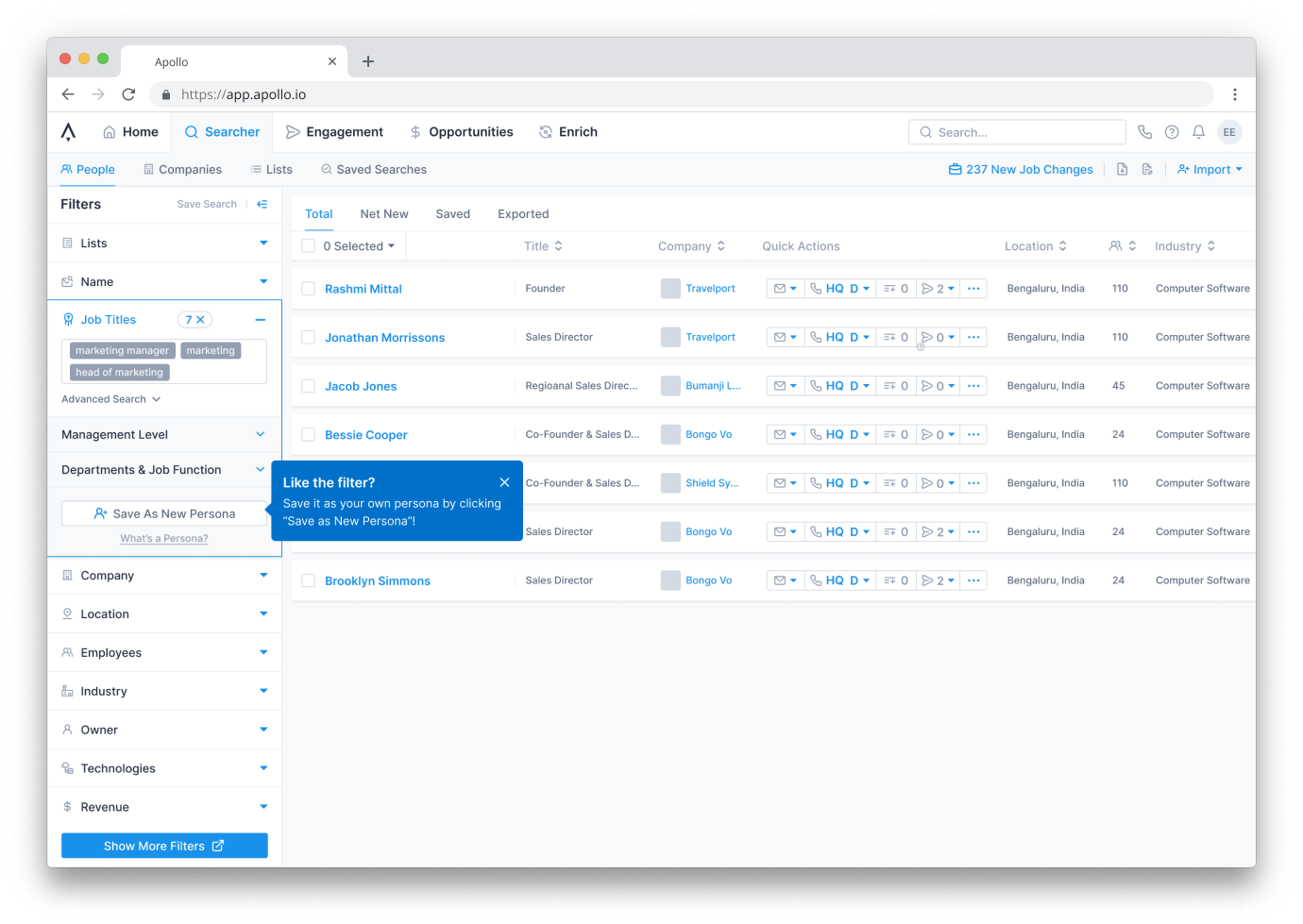
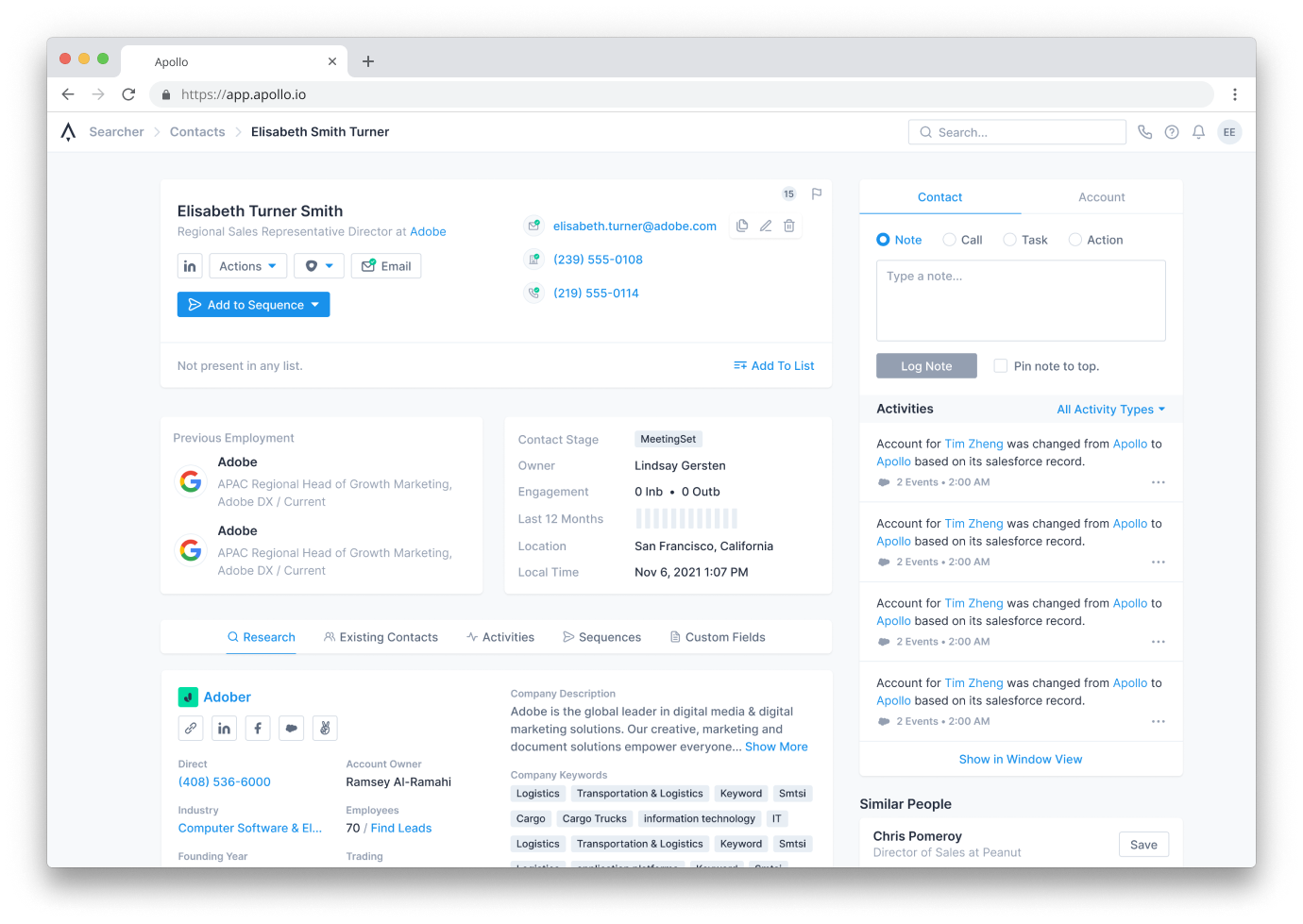
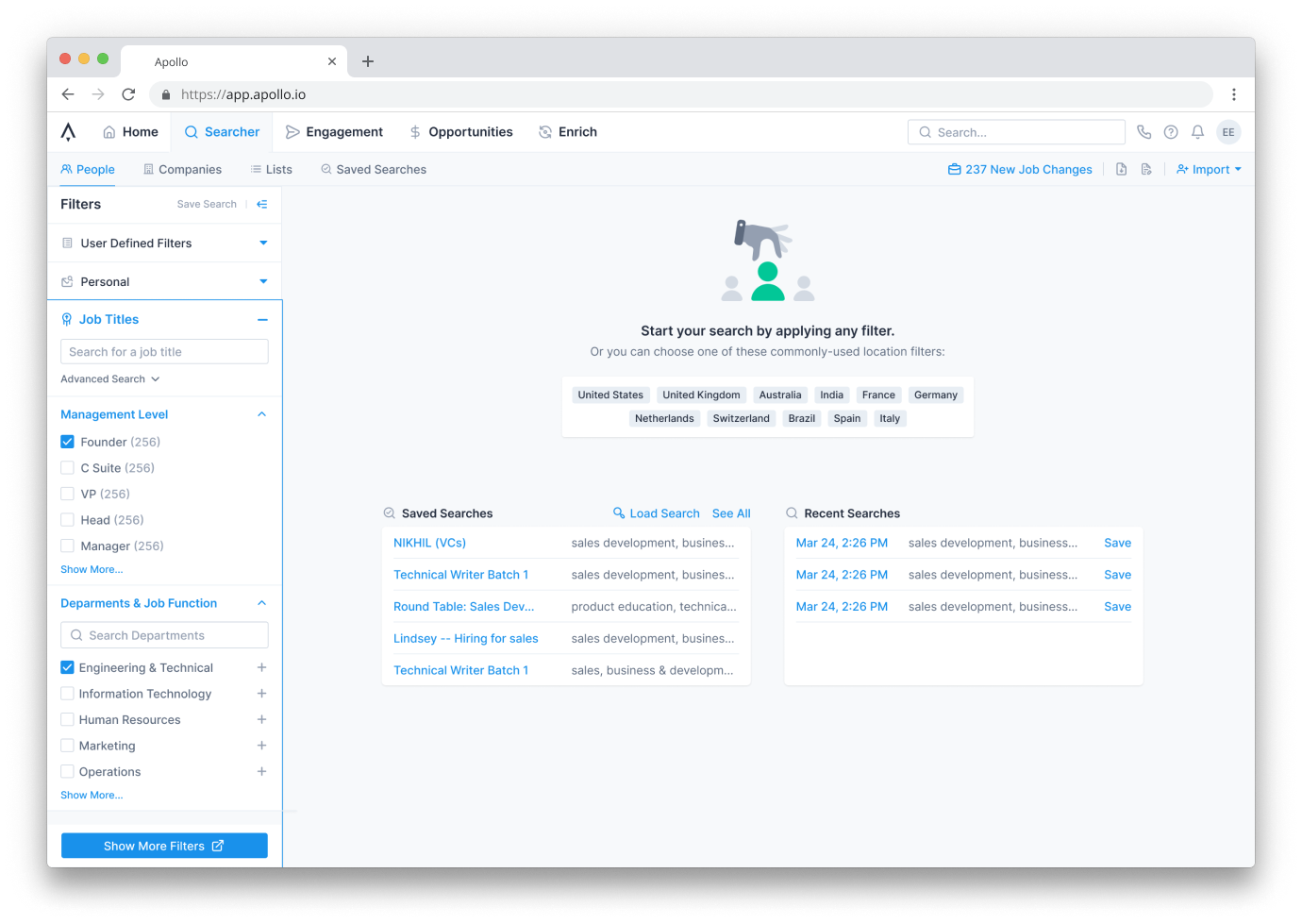
The main complaints: confusing clutter, hard-to-find information, and useful features that were buried. I tackled these through information hierarchy changes, reducing visible information density on first load, and feature walkthroughs based on use cases.
Onboarding Overhaul
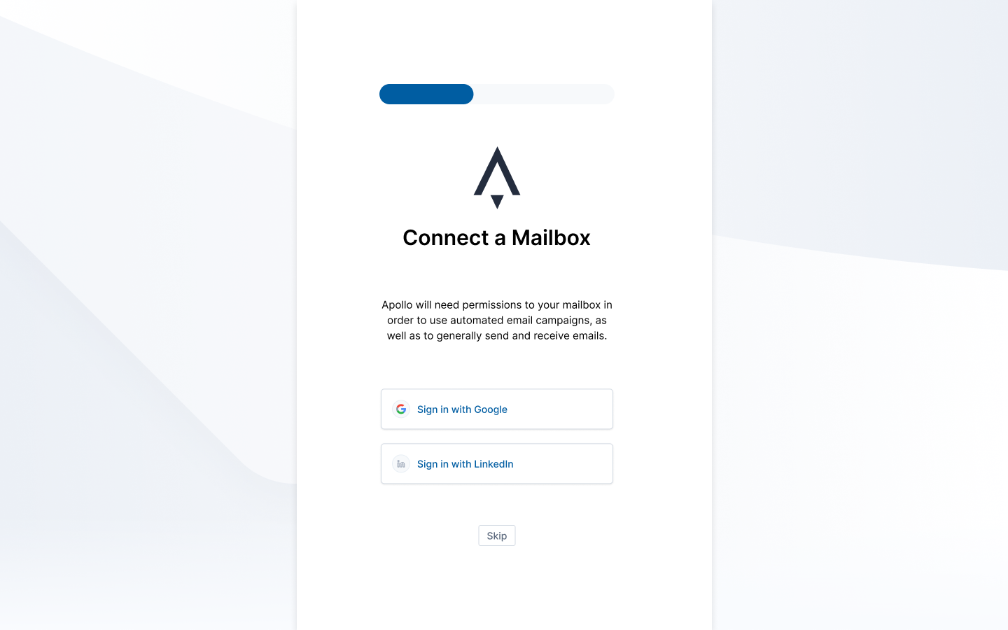
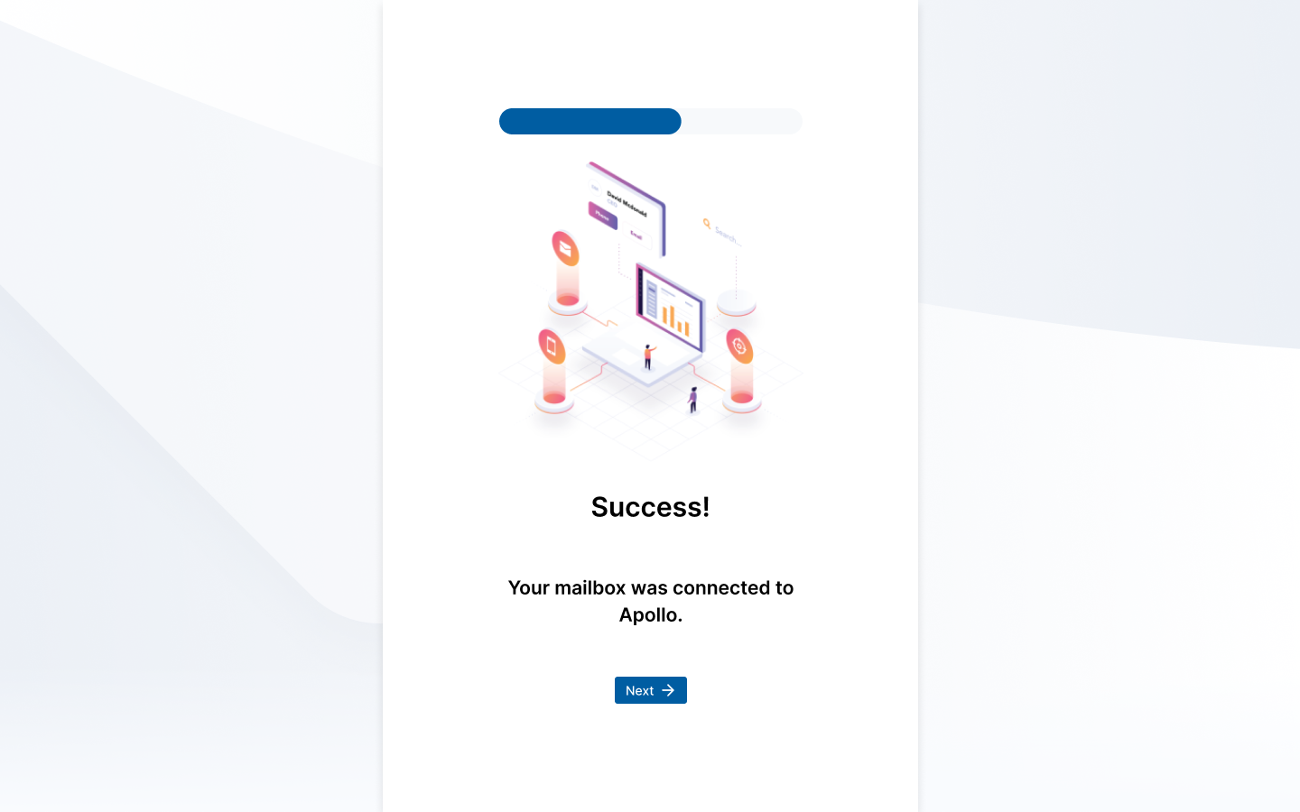
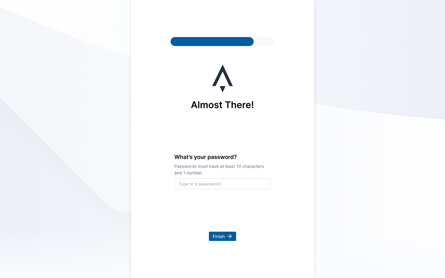
The walkthrough concept led me into secondary research on SaaS onboarding. I studied flows from Slack, Figma, and others, and read analyses like UserPilot's State of SaaS Onboarding. Key gaps in Apollo's onboarding:
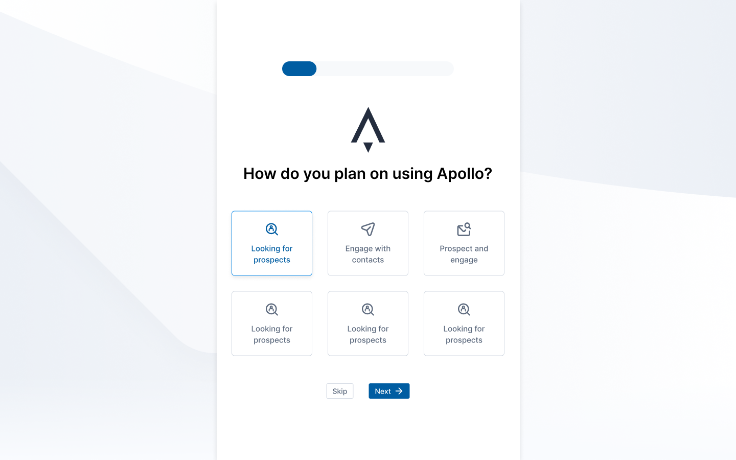
- No workflow guidance based on user role
- No progressive feature introduction
- No animations or personality to make the platform feel alive
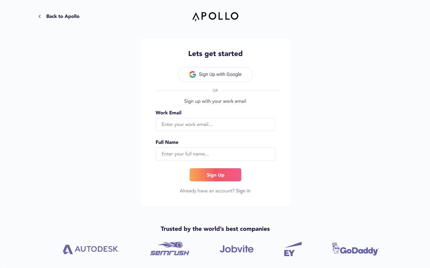
I wireframed a redesigned account onboarding process with personalization and clearer step-by-step flows:
Accessibility
I launched Apollo's first accessibility initiative after taking a LinkedIn Learning course and studying Microsoft's inclusive design philosophy and case studies from Stripe and Slack. I audited Apollo's design system and product, then put together a plan to improve:
- The color scheme (which severely lacked contrast)
- Layout of items to promote accessibility
- A shift toward designing for inclusion rather than a specific persona
Conclusions
- 3 of 5 proposed design changes accepted and implemented — filter reorganization, information hierarchy improvements, and feature walkthroughs
- Presented 35+ onboarding improvements to the VP of Growth, resulting in a roadmap the design team continued after my internship
- Launched Apollo's first accessibility initiative — an audit of the design system and product that kicked off a color palette revamp
- Ran the full research-to-design loop as the sole UX person at a 150-person Series B startup