Plover — running training analysis
I designed the run journal and evidence charts, and built the Python analysis pipeline and shared chart components with Claude Code. I reviewed detector citations and corrected unsupported injury-risk claims; Claude Code wrote most of the implementation.
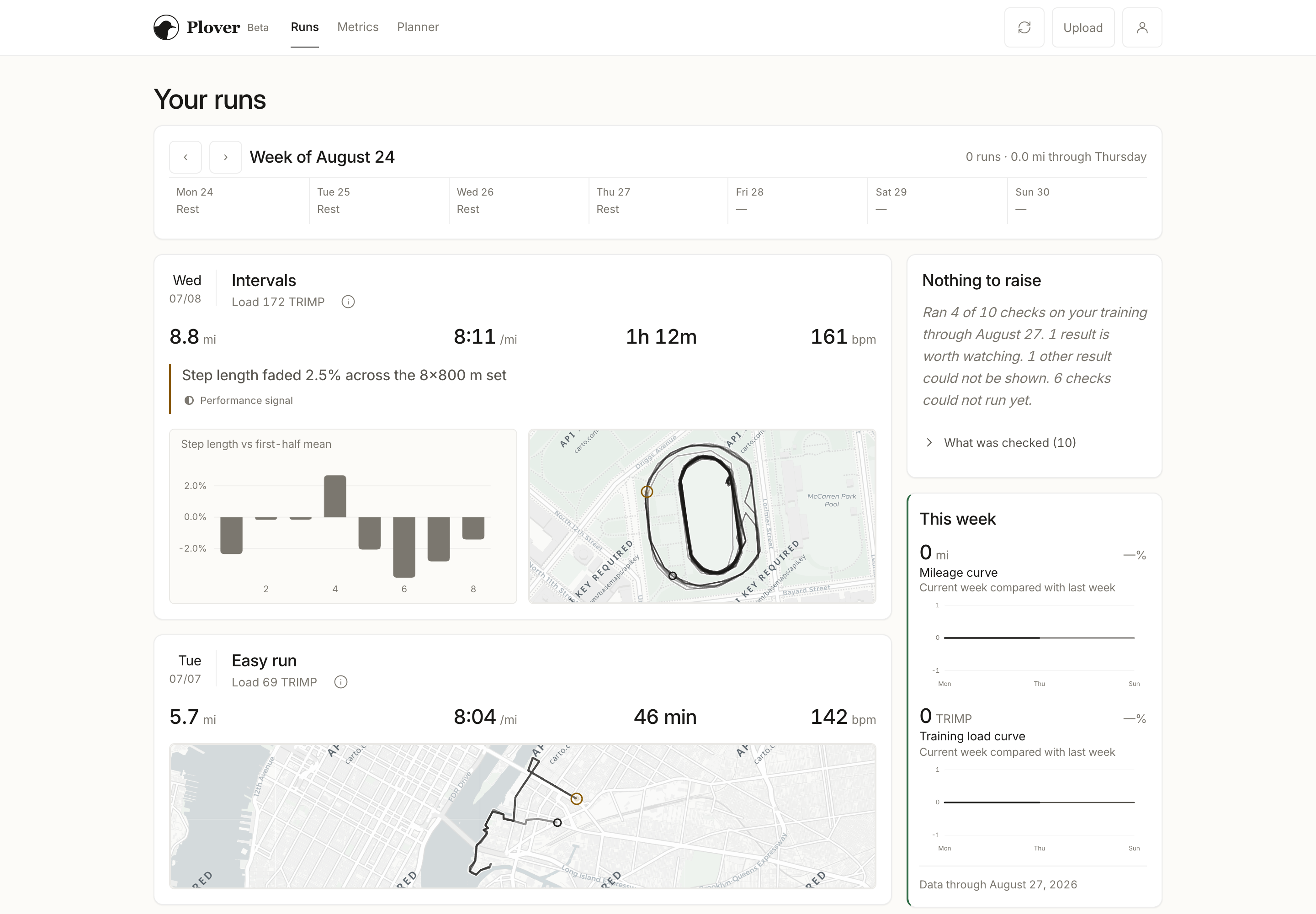
Solo designer & engineer | July–present
Tools: Python (pandas, scipy), FastAPI, React, Next.js, Capacitor, Claude Code Platform: Web · plover.run · private beta
Building the running analysis I wanted
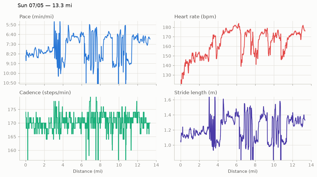
I've been running for a few years, and I've tried a lot of analytical tools: Strava, intervals.icu, Runalyze, TrainingPeaks. They all gave me useful information, but none of them scratched the itch I had as someone with a background in data science. I wanted something between a single training-load score and hiring a data scientist to read my runs. Does my cadence or stride length change as a run gets longer? How much does my heart rate drift while I try to hold the same effort? I built Plover around those questions, with explanations I could follow back to the measurements.
It started as a Jupyter notebook over my own Coros files, whose cadence, stride-length and effort-pace fields are undocumented enough that I had to work them out empirically, one figure at a time. What pushed it out of the notebook was the manual part — downloading and uploading each run file to see anything new. About twelve days later I had a deployed app on Google Cloud with authentication, storage and a per-user pipeline, and I've been using it inside my own build-up for the NYC Marathon and the California International Marathon since. I am still its only user.
I also had to decide what the app could reasonably claim from my own data. Claude Code wrote most of the implementation and ran the literature survey and verification work described below; the decisions about what the app shows, and what it may claim, were mine.
Making the findings readable
I explored ten visual directions as HTML mockups, each filled with my own running data rather than placeholder numbers. I shipped the frosted-glass direction first — on its own I liked the depth and the soft gradients — but with charts stacked on it the blur competed with the numbers I was there to read, so I removed it.
Leading with the finding, then letting me check it
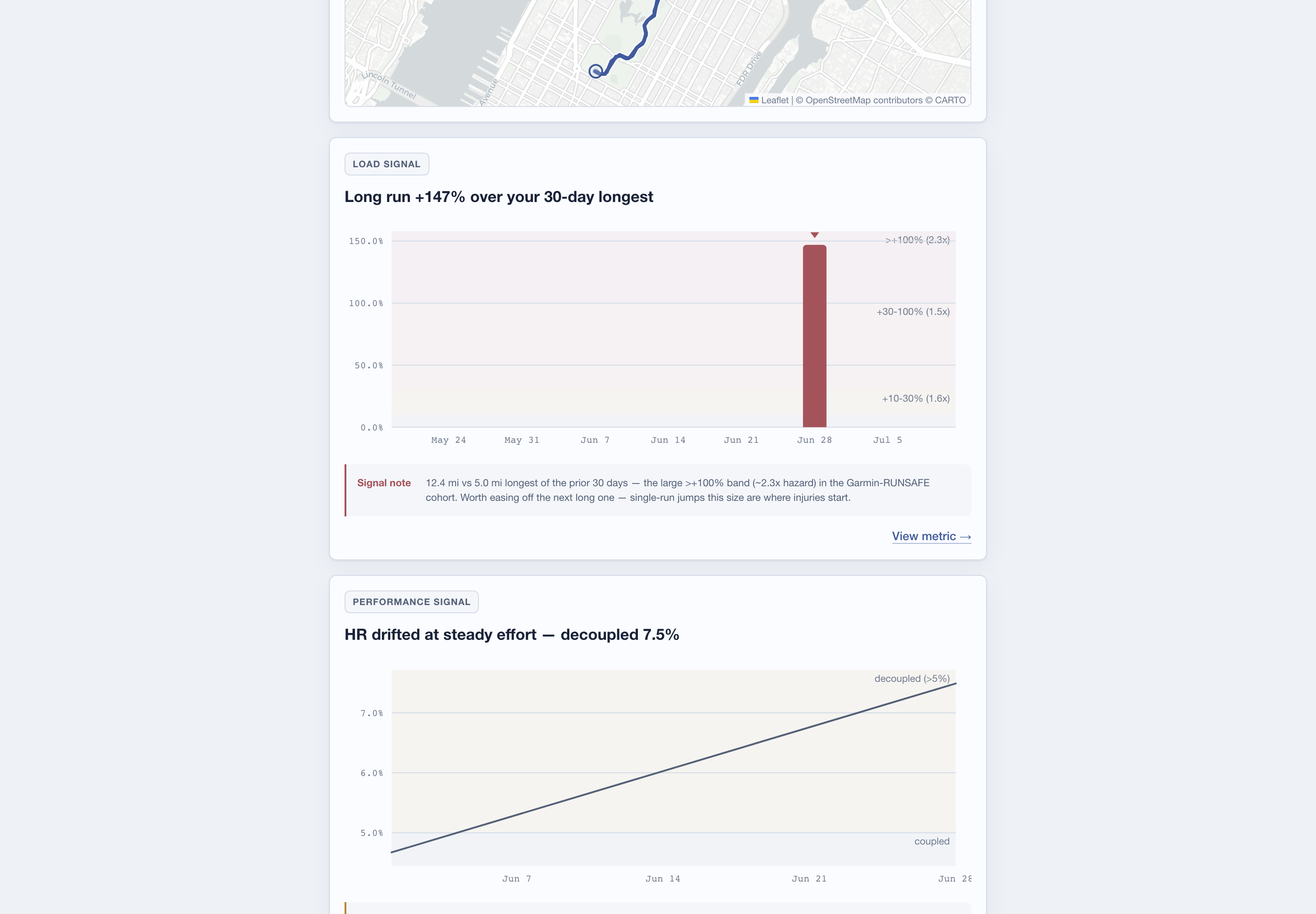
What bothered me about other tools was a screen full of scores with no account of what had changed. So a run card opens with a sentence, then its measurements and a named comparison set such as "3 of 7 comparable runs" — I read the finding first, then audit what it rests on. Metrics stay in neutral ink so they don't compete with the zone bands, and treadmill runs draw fewer charts because they have no route or GPS pace. This flagged run reads "Long run +147% over your 30-day longest," with the chart underneath showing the comparison the sentence came from; each metric opens into its own chart, explanation and citation.
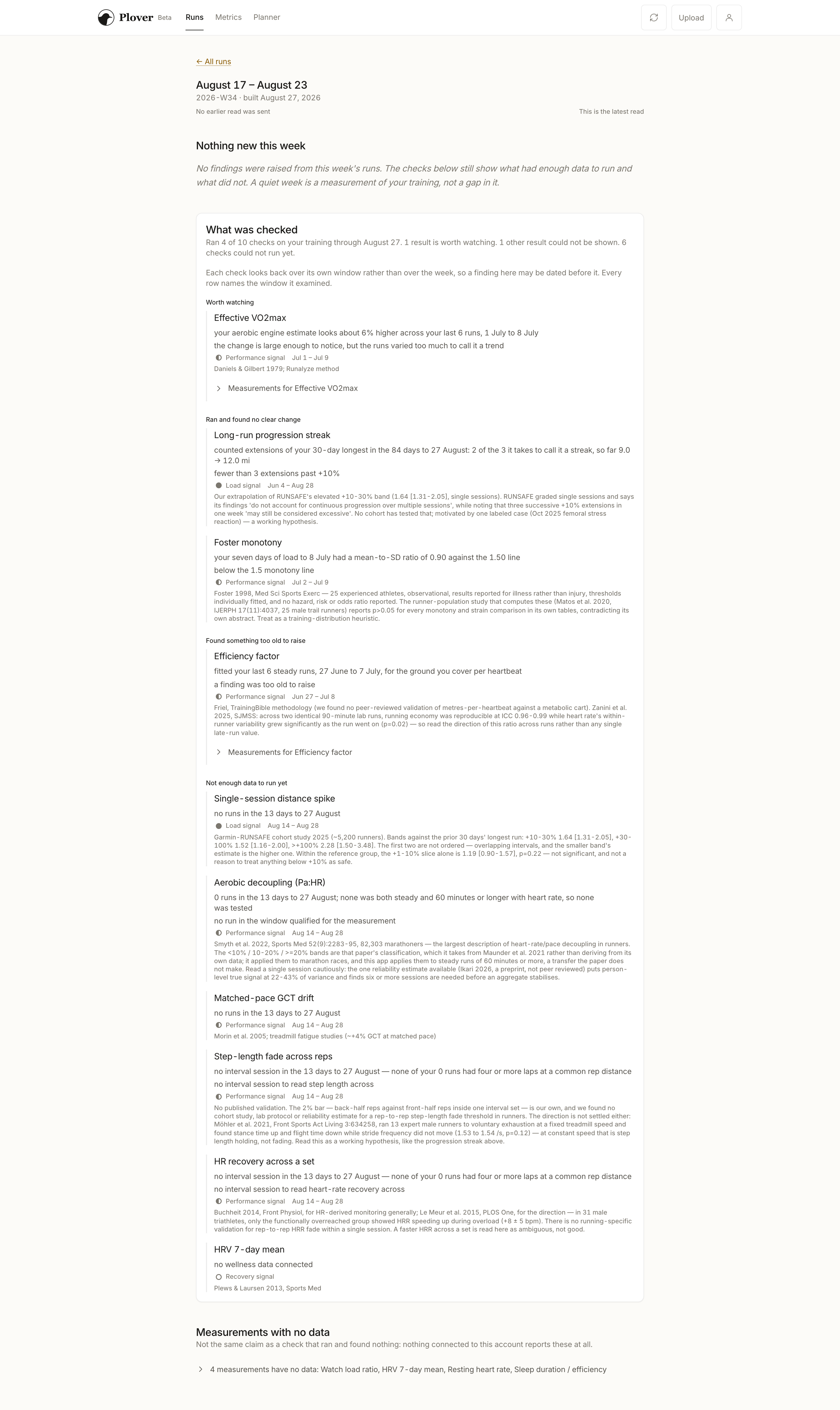
Saying what wasn't checked
I applied the same rule to weeks, because a quiet screen shouldn't imply that everything was checked. The weekly digest lists the checks that ran and the ones that had no data, each with its window and source paper, and I replaced "All clear" with "Nothing to raise" — not finding a signal isn't proof of safety. Only 4 of my 27 runs currently qualify for insights at all, and those cards name their reference sets and their limits.
Revising the run journal
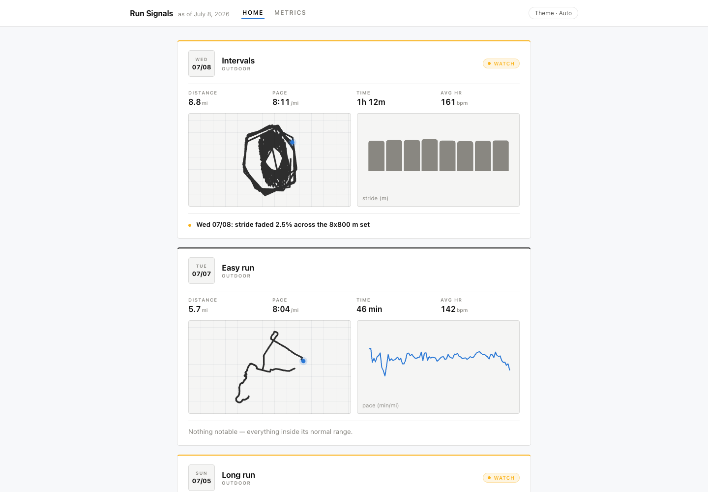
An early review of the next direction called out the flat route maps and the teletype numerals. I put CARTO basemaps under the routes, drew a route glyph as the identity mark, moved the figures to a tabular sans and pulled the plain-English note to the top of each card. Below, the Swiss-grid era, then still called Run Signals, is on the left; the current run journal is on the right.
Re-reading my own citations
The evidence tiers came out of an agent-run survey of the literature: load as well-studied, gait fatigue as moderate, recovery and HRV as thin. When I went back to the papers behind my own thresholds, the tiers didn't hold. In the Garmin-RUNSAFE cohort study, the acute-to-chronic workload ratio was inversely associated with injury rate — the opposite direction to the claim I was making with it. I removed it and a weekly-ramp check from the injury-risk tier, kept both charts because they still describe training, and dropped the session-spike detector's unsupported "safe zone" language.
Narrowing the claims cost me coverage I had been counting as a result: the shin-splint backtest went from flagging four pre-onset weeks to three. Every citation in the catalog gained a source link and a caveat field, and one +4% threshold I couldn't trace to any paper stays labelled in the app, pending review. One detector — repeated increases in long-run distance — is my own extrapolation from a stress reaction the other detectors missed, so its severity is capped and its citation says so. Two of my own injuries helped me decide what to investigate; they don't establish that Plover can predict injuries.
Keeping the results reproducible
Leaving the notebook meant the same calculation had to survive new uploads, changed detectors and daily use, so I kept the training math in Python and had the pipeline emit chart specifications instead of finished charts. One chart component renders every metric from those specs, and the app and the marketing site draw from the same code, which keeps a figure on the website from drifting away from the one in the product.

Three checks cover the ways results can quietly diverge:
- When I change a detector, I want to see what changed in past results. Each detector takes an as-of date, and the backtest replays history through the same feed builder the app uses. Refactors have to reproduce its output byte for byte.
- A new upload shouldn't expose half-written results. Storage is content-addressed, and the generation pointer moves only after the files are written, so readers stay on the previous generation until the new one is complete.
- Faster processing still has to give the same answer. Uploads re-parse only new files, and CI compares the incremental result against a full recompute.
Two performance decisions came out of daily use: the feed stopped shipping every run's detail, turning a 1.1 MB payload into a 28 KB index with details fetched on demand, and tracing the imports that pulled pandas onto the Cloud Run startup path took cold starts from 17 s to 3.2 s.
The same pipeline carries a CI check for injury-prediction language and for severity numbers shown without context, because the equality checks only tell me a number didn't drift — they say nothing about whether the claim attached to it is supported.
Current limits
- I've only tested it with my own running data — 27 runs. The gait-fatigue and recovery tiers need more evidence and other runners.
- It does not predict injuries. The chained-extension detector is my own extrapolation and needs cohort evidence before I raise its confidence; the +4% threshold has no traceable source and is labelled in the app.
- Ingest still computes every TRIMP number from my own heart-rate values. Heart-rate max and resting HR are per-user on the planner path, but not there.
- The planner's pace-to-heart-rate projection is a least-squares fit with an r² of 0.27 on my dataset. The app labels the planner experimental, but doesn't yet refuse to prescribe from a poor fit.
- Invite and allowlist tooling has only been tested against a dev server. The waitlist is live; general access is still ahead.
Outcomes
I use it during marathon training instead of a notebook I update by hand. A flagged run opens with a sentence and the comparison set behind it, and the weekly digest names the checks that ran and the ones with no data. Since the first deploy it has also gained a planning calendar and an iOS build shipping from CI. I don't yet have evidence that any of this has improved my training.
The app is in private beta. The website and waitlist are at plover.run.