UX Intern
June - August 2021
Tools: Optimal Workshop, Figma, Miro, Fullstory, Amplitude
Platform: Web
Role
Apollo.io is a business-to-business (B2B) sales prospecting and engagement platform with over 150 employees and over $40 mil in funding through their Series B.
When I started at the company, I was the only UX person present. I was tasked with the broad task of trying to reduce mental strain of the product, especially for new users. Through the experience, I was able to direct myself in solving the problem, and learned more about usability niches like onboarding or accessibility.
Overview
I conducted 10 remote interviews that included a think-aloud protocol and a semi-structured interview. I also analyzed usability with 60 hours of footage in Fullstory, which featured people using the software. After analysis of results, I had three accepted design changes out of the five proposed, which were designed in Figma.
To help new users better acclimate to Apollo's product, I presented a plan to the VP of Growth overhaul the onboarding process based on industry standards and an analysis of the app, yielding over 35 suggested changes
While at the company, I also launched an accessibility initiative that started a color palette revamp, a design system audit, and more inclusive design thinking. As Apollo grows, these will help Apollo cater to an even wider audience.
The Task at Hand
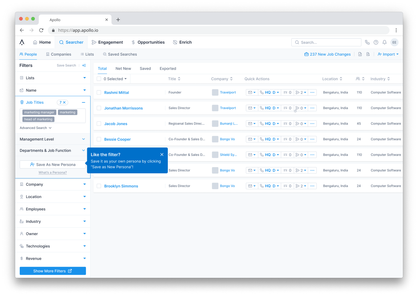
The immediate problem I was given to tackle was: how might we decrease the mental strain of the user interface on a new user? Specifically, I was supposed to try to implement a plan to improve one of two major aspects of the product, the prospecting/search functionality.

At first glance to a new user, there's a lot going on. In addition to the 11 filters, the pop ups and calls-to-action can be distracting or disorienting.
Before I was onboarded, people on the growth team were already focused on making the people filtering more intuitive to a new user. With filters as my first area of focus, my first few orders of business included:
1. Interviewing users to learn about their current workflow
2. Interviewing new users to learn their first impressions of Apollo's dashboard
3. Conduct a survey to find the most important categories to help condense filters
Starting User Research
To start, I used Apollo's prospecting tool to find people who worked as sales development representatives (SDRs) who had never used Apollo, since that was the main persona Apollo marketed itself toward. Through this recruiting, I found 10 SDRs who used modern sales software, and who were willing to give time out of their day to test new software.
For my interviews, I modified a previous script to better fit what I was looking for. In each of my 10 interviews, I started with a contextual inquiry, where I would ask the SDR to walk me through their current prospecting workflow. My goal here was to better understand how and why they interacted in certain ways with certain features.
After, I conducted a 15 minute think aloud protocol to find pain points in the current interface. I ended with a semi-structured interview to ask about features I didn't mention or ask about earlier.
At the end of each interview, I debriefed by summarizing key insights from the interview.
Once I completed my 10 interviews, I created an affinity diagram using the insights from each interview I collected, and found a few general areas that needed improvement.
Common issues included clutter, low contrast UI elements against the background, unclear language, and not finding features in expected places.
Card Sorting
Concurrently with the user interviews, I ran a card sort to find a better hierarchy for the 100+ filters that Apollo had, using OptimalWorkshop's software. My subjects were SDRs again, this time including those who had and had not used Apollo. In the card sort, I surveyed for experience with sales software. While my sample size (n = 14) was not large enough to be statistically significant, I did encounter some consistent groupings between what both groups answered, which gave some valuable insights about how filters should be presented.
Initial Findings
The main complaints from interviewees included a confusing, cluttered interface, hard to find information, and many features that were useful, but hard to find.
So, I set out to try and improve these aspects in different ways. For some, I simply tried to rearrange the information hierarchy so the more important information was at the top. For others, I tried to reduce the amount of information visible when someone first enters the searcher.
One that was well received by other product managers and product designers, however, was an idea to have walkthroughs for different features based on use cases or experience with the platform.
In this prototype, as people use features, they get tooltips about more advanced features
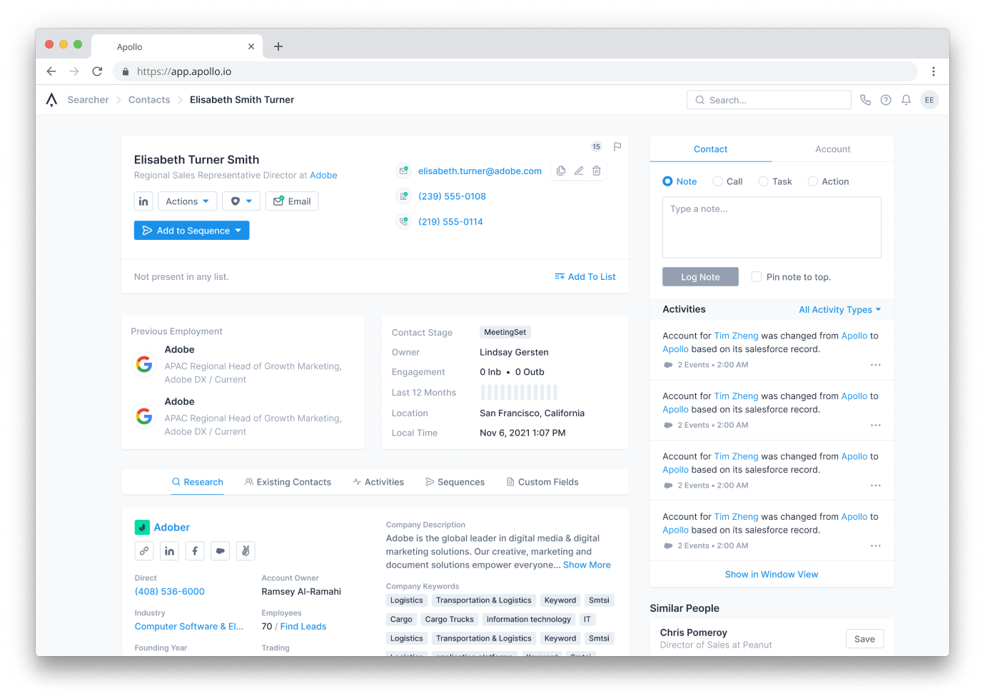
A reorganized profile page for better information hierarchy

By default, management Level and Departments & Job Function would show all filters. This shows the top 5 in each.
An example of collapsed filters after user research.
Learning about Onboarding
Because these "walkthroughs" were similar to onboarding, I started doing secondary research into the onboarding process at different SaaS companies, and what makes them effective and what parts can be improved. I elected to do this rather than making iterations through interviews with the current process because my time was limited, and I wanted to finalize a plan to help new users onboard.
In this part of the process, I read a dozen case studies about revamping the onboarding process and their effects, such as Slack's or Figma's onboarding flows. I also came across many best practices blog posts, like UserPilot's State of SaaS Onboarding. I also studied a number of onboarding processes successful at introducing a new user to their product, like that of Hubspot's or Duolingo's. Through these, I learned a lot about specific areas of the onboarding process that Apollo lacked or relied on customer success to do, like showing them the proper workflow based on their job, progressively introduce the features of the product, or just adding some kind of animations to make the platform feel more lively.
One thing I tried to wireframe was a mock account onboarding process that incorporates personalization, and a clearer step-by-step process to getting signed up.
A set of mockups for a new onboarding flow
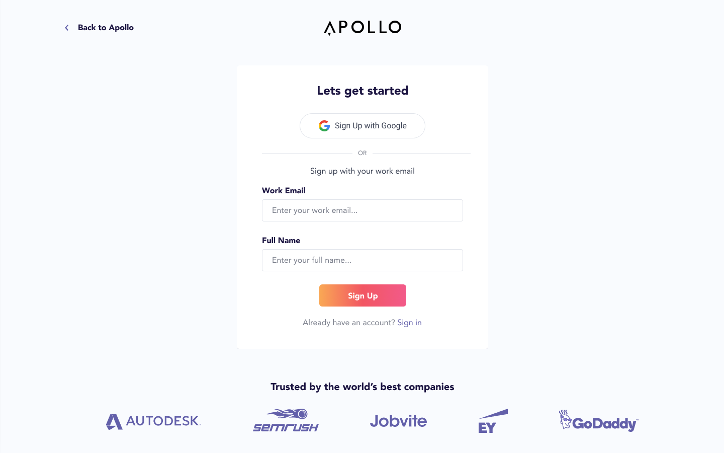
User signs up
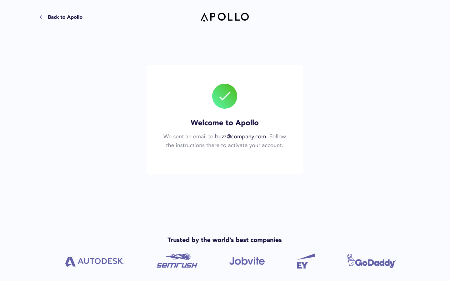
Gets feedback that a confirmation email was sent
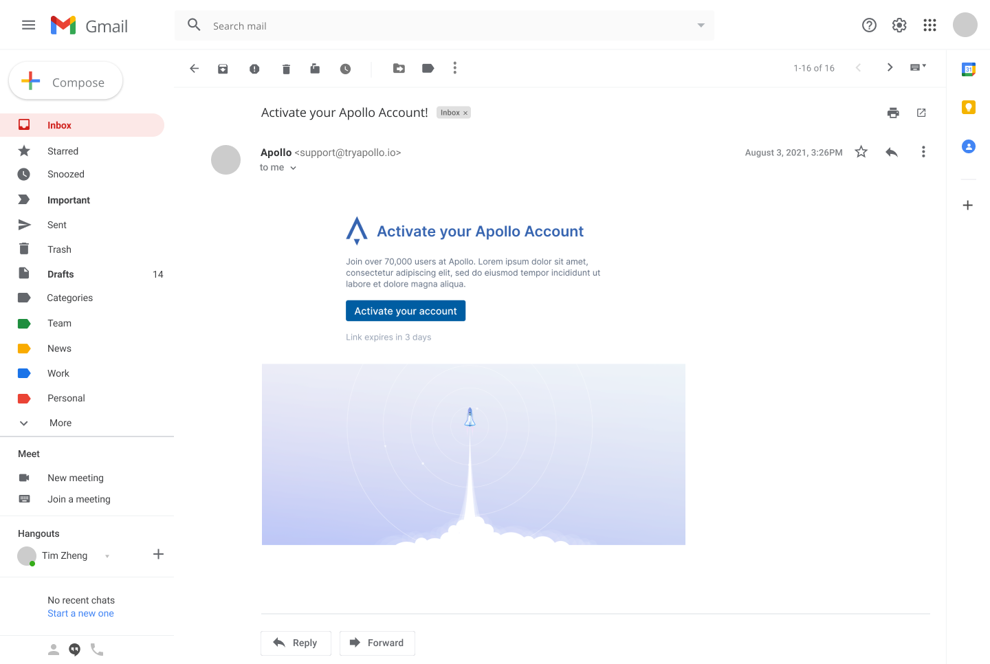
Email includes graphics and branding
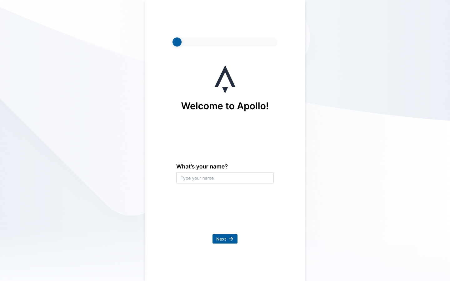
User starts onboarding process
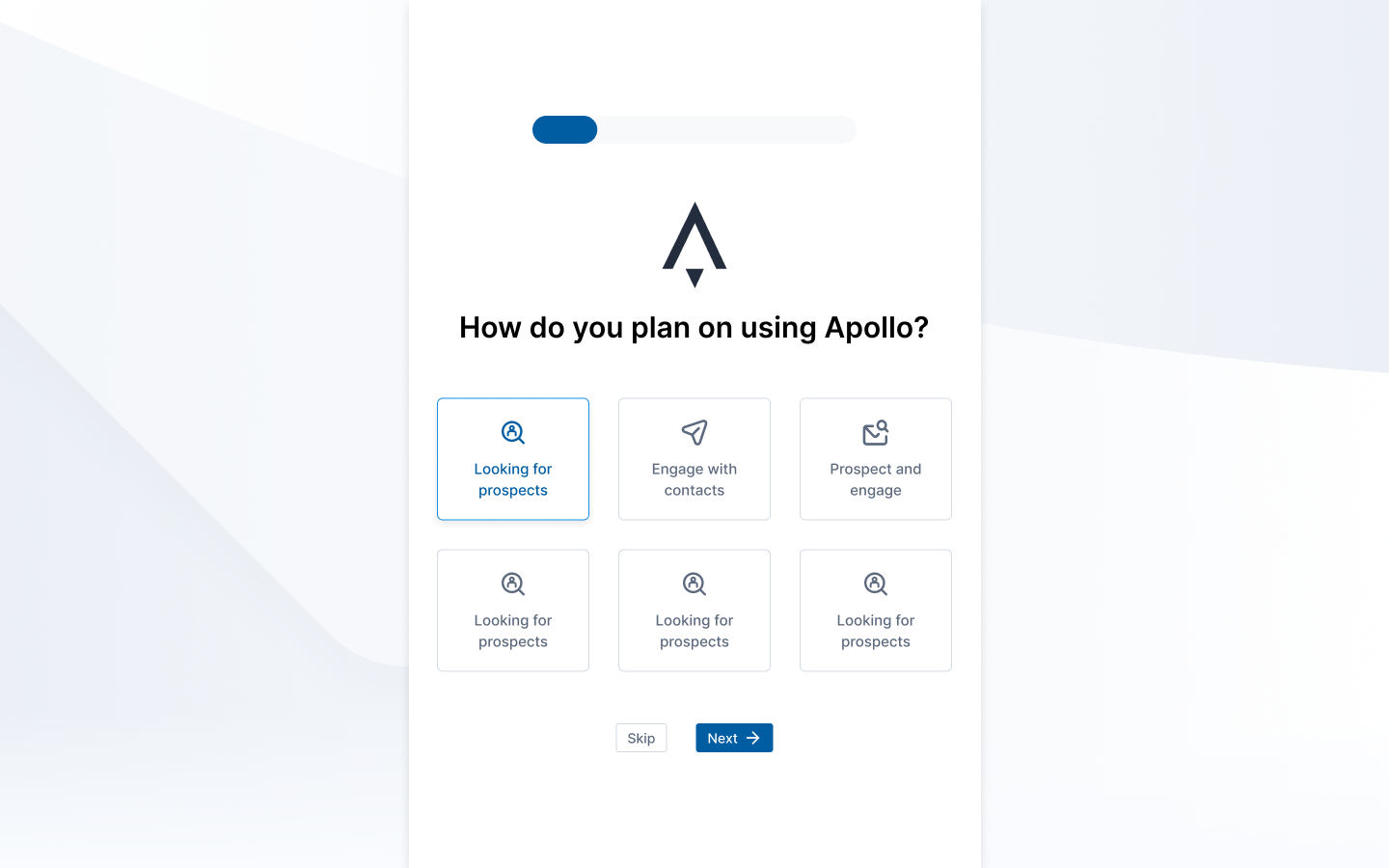
They then select their role so Apollo can customize the onboarding setup
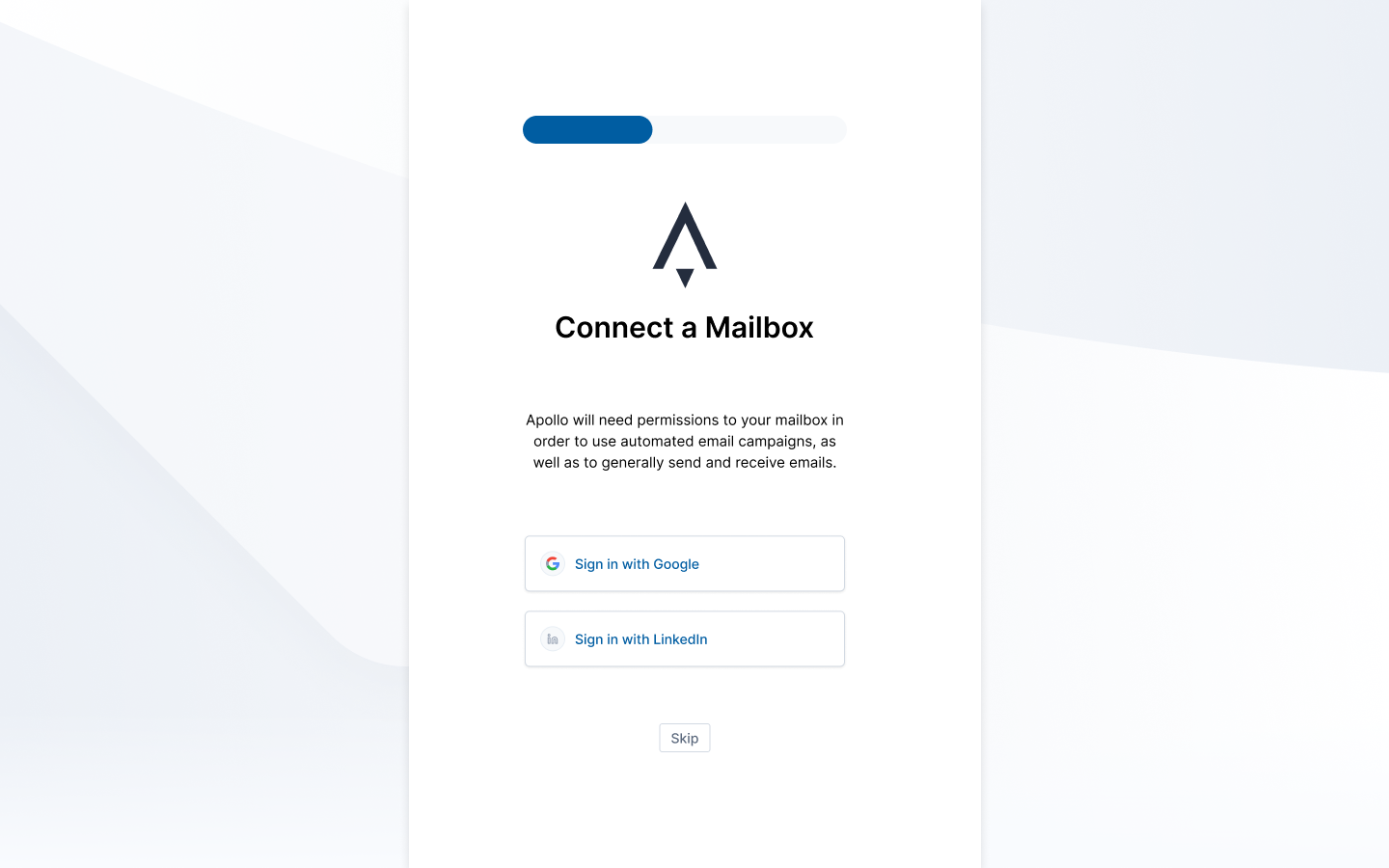

Feedback for successfully connecting a mailbox
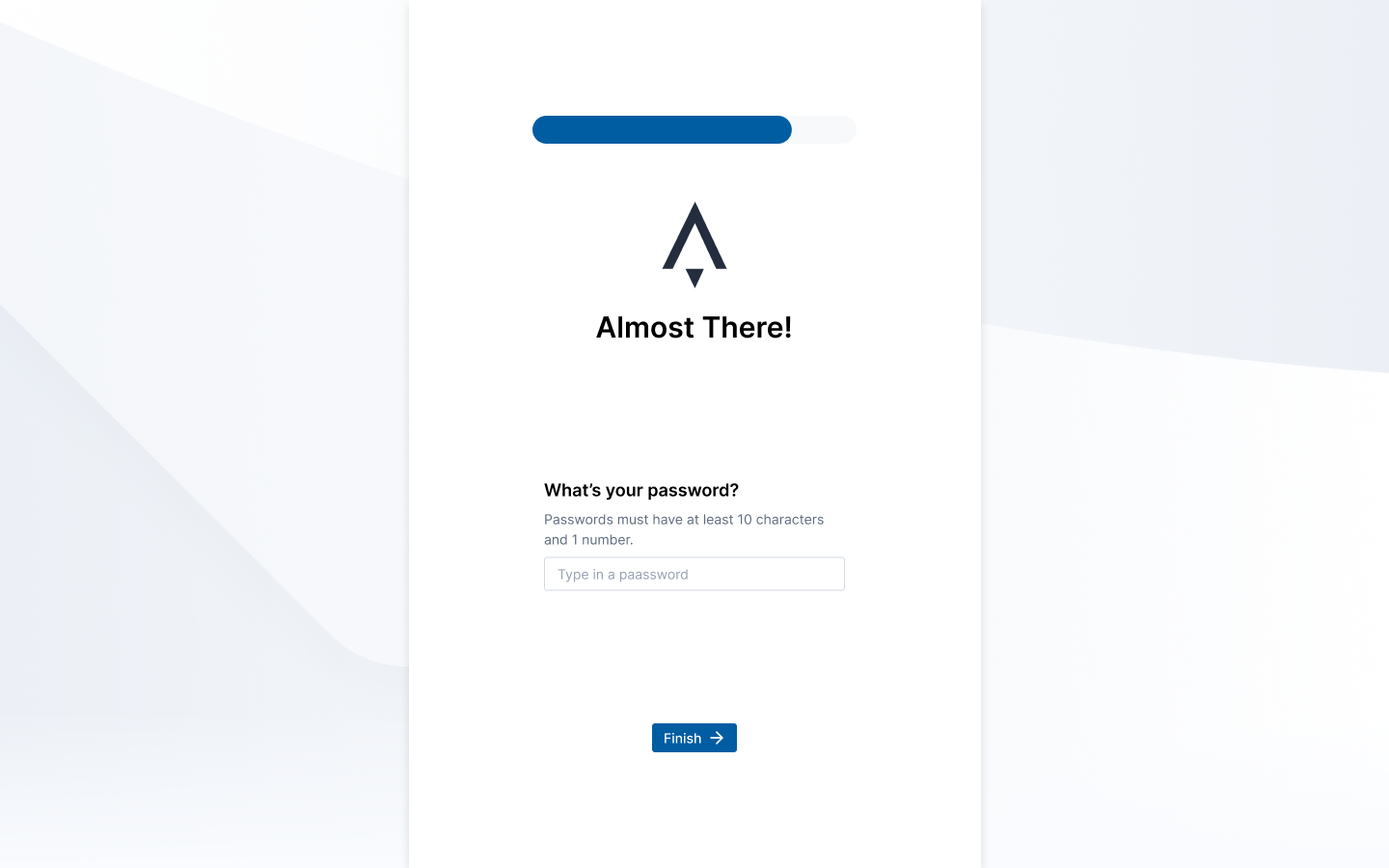
Adding encouragement and a clear indication of password requirements
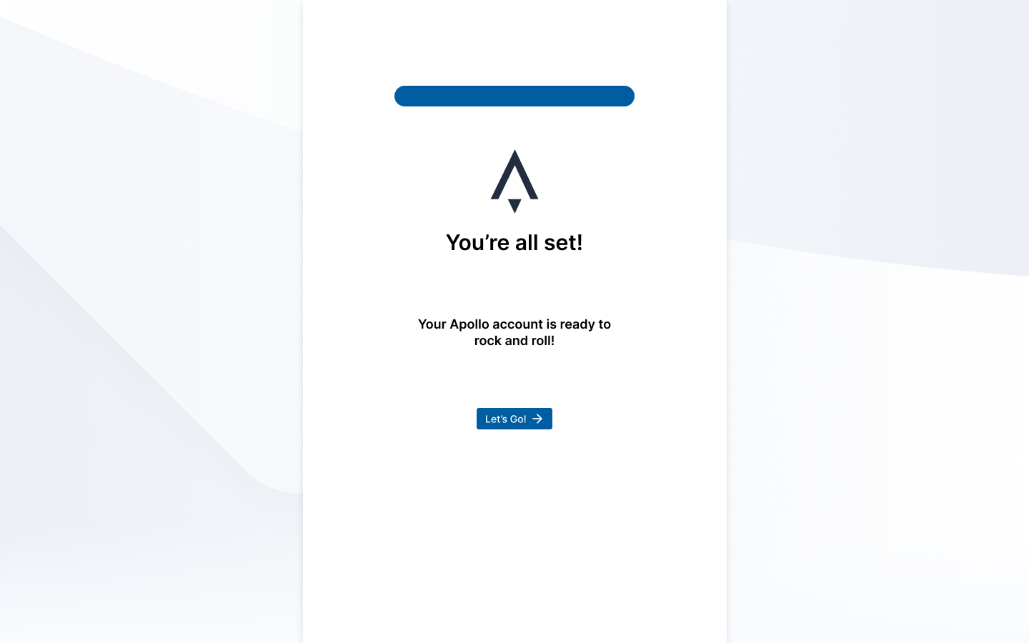
Fun messages that help build excitement for the user
More about Accessibility
On the accessibility side of things, I also did some learning to better understand what it means to make a product accessible. I took a LinkedIn Learning course about accessibility, what makes a layout, either mobile or desktop, accessible, and how to make sure our web pages are accessible. I started reading through Microsoft Design's inclusive design philosophy, and watched a talk about auditing design systems for accessibility. Like with the onboarding process, I also read several case studies about how companies improved the accessibility of their products, whether it's improving the contrast of Stripe's color palette, or Slack improving general accessibility.
From these and the roughly dozen other readings I did, I audited Apollo's design system and product, and put together a plan to improve the color scheme (which severely lacked contrast), improve the layout of items to promote accessibility, and generally how transition toward designing for inclusion rather than a specific persona.
Conclusions
In the end, I was given a lofty goal and tried my best to make progress in the direction.
At the end of my time, I created a timeline implement a better user onboarding scheme, improve the accessibility of the site, and promote accessibility within the product's design.
As of now, the design team is still expanding, but progress toward creating a better onboarding experience, introducing users to more advanced features, and inclusive design principles are still being made.
Please note: for confidentiality reasons, I am unable to include links to some relevant items, such as affinity diagrams or Figma prototypes.