Responsive Website Design
November - December 2021
CMU Coursework - Interaction Design Studio
Skills used: Intercept interviews, journey mapping, paper prototyping, Figma prototyping, Figma animations, pitching
Project by Joanne Aire-Oaihimire, Angie Li, Sidra Manzoor, and Harvey Zheng
Overview
The overall goal of the project was to design a responsive website that solved some kind of a user need we uncovered through rapid user research. The area my team chose to focus on was in the pet adoption process.
We conducted 8 intercept interviews with people who had adopted pets, created journey maps from our interviews, and then found a user need in reducing competition for pets. From here, we created wireframes and paper prototypes.
After testing our paper prototypes on other classmates, we moved into creating medium fidelity prototypes. After a critique, we then created high-fidelity prototypes with animations.
Rapid User Research
For our 8 interviews, we found people who had previously been involved in the pet adoption process, whether they are pet adopters, or they volunteer at a shelter. From this research, we uncovered a few key insights:
1. Adoption process with strict requirements can be overwhelming
2. Adoption process is low tech for payment and forms
3. Some pets are more popular than others
2. Adoption process is low tech for payment and forms
3. Some pets are more popular than others
Customer Journey Map
After, we transformed our interviews into journey maps, and then combined them into a single customer journey map. From this journey map, we gained a better idea of the pain points someone experiences during the pet adoption process. We went through a round of critique on our combined journey map, and came out with a more refined journey map.
Prototyping
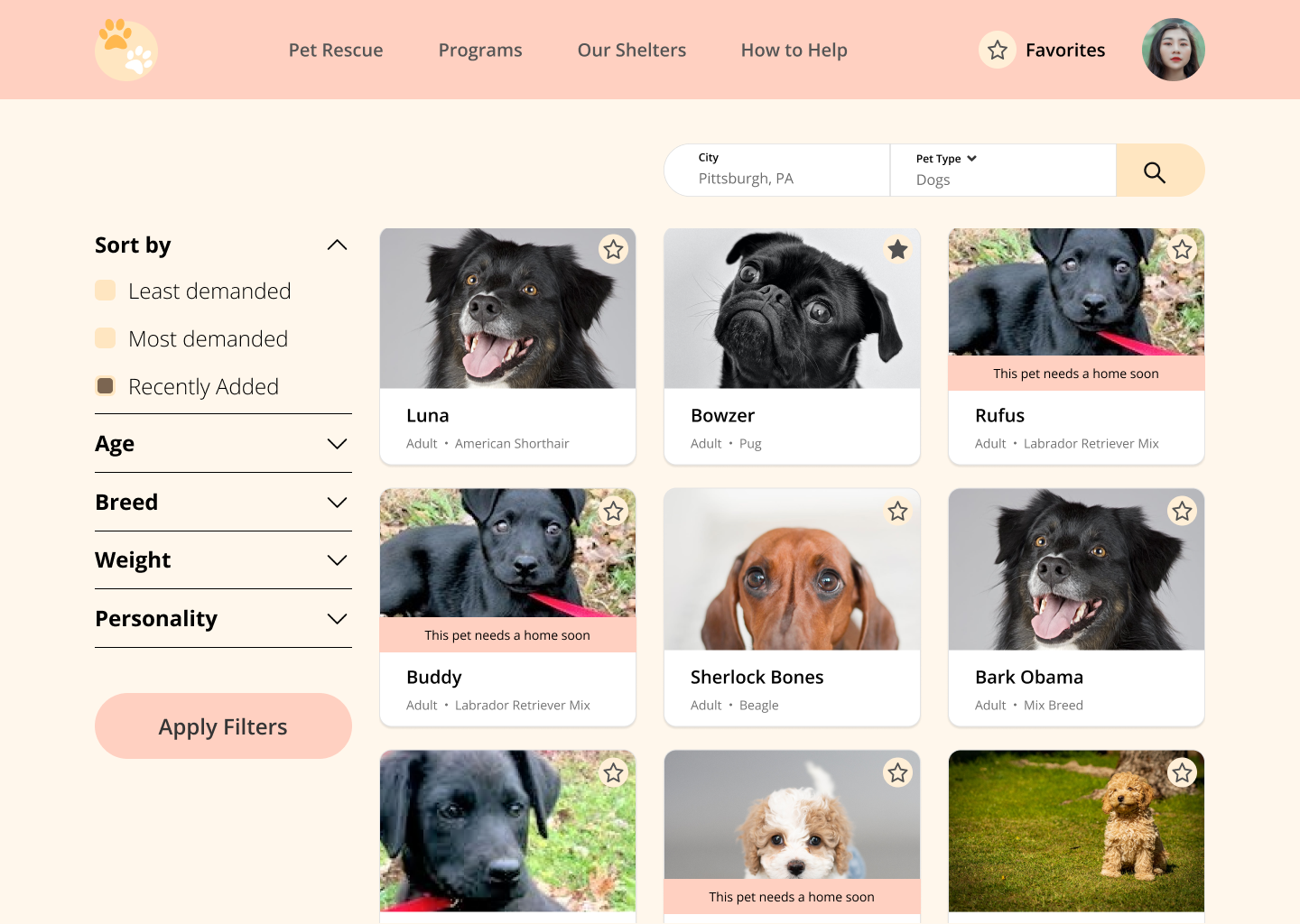
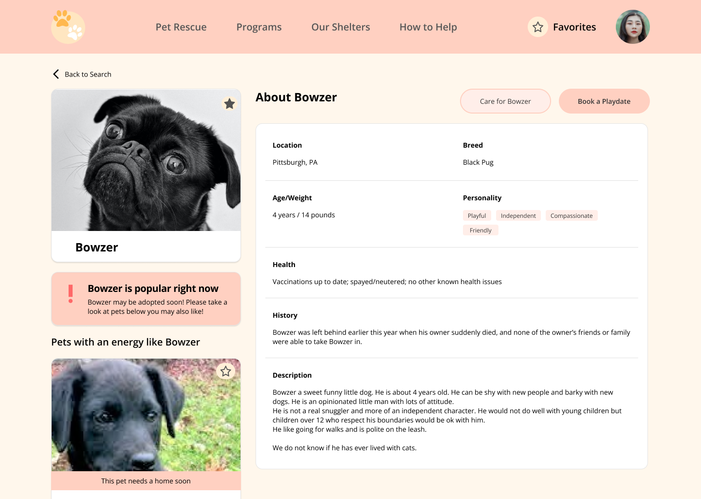
As a group, we decided to focus on reducing competition for high-demand pets, and redirecting them to more neglected pets.
To start, we made wireframes and paper prototypes. We then tested our paper prototypes in class.
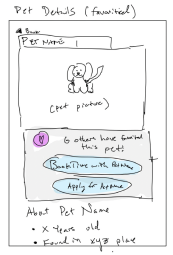

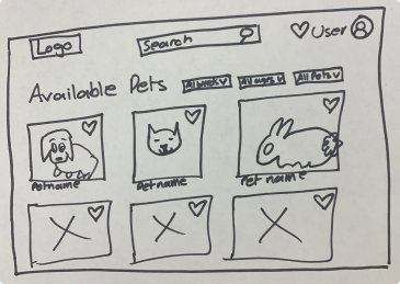
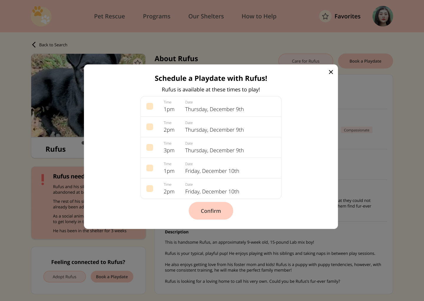
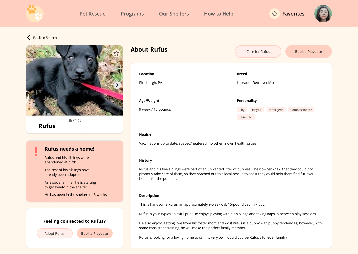
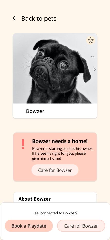
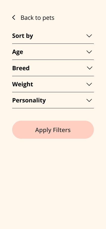
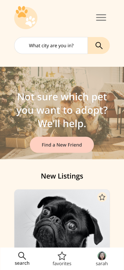
After testing our paper prototypes, we moved into Figma to create mid-fi, and then hi-fi prototypes after a round of critique.
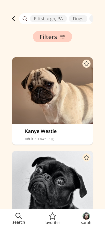
Mobile Hi-Fi Pages
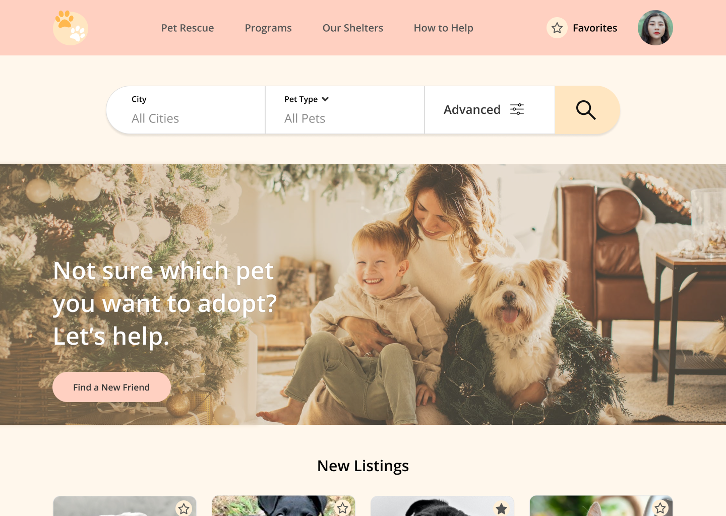
Desktop Hi-Fi Pages
